Have you ever wondered what’s the secret of such well-known brands as Nike, Adidas, Tiffany & Co, Dropbox, and others? What makes first-time visitors take a closer look at their offerings, subscribe to their news feeds, and buy? Before a user puts his/her hands on the products they develop, there should be something that guides them towards completing a purchase. In addition to cleverly-built marketing campaigns, such companies boast professionally designed websites where every single element serves a particular purpose. CTA buttons are among the most powerful conversion-oriented elements. So, let’s see how the world-known brands and such ready-made eCommerce solutions as PrestaShop designs and Magento designs by TemplateMonster use the power of high-converting CTAs.
WHY ARE CTAs IMPORTANT?
CTAs are essential for every business project. The following stats are impressive prove to this.
- An average of 90% of online visitors who read your headline will also read a CTA copy.
- Adding buttons to articles increases revenue by 80% on average, with a 49% boost of an average order value for blog readers.
- Adding CTAs to emails can increase click-through rates by 300%.
Accompanying videos with CTAs you can grow conversions by 144%.
CTAs OPTIMIZATION
A CTA won’t work to its full potential unless you know the secrets of their more effective performance.


- Make sure that CTAs stand out from the rest of the content provided on your site’s pages. The place where a CTA is added should look uncluttered. According to VWO, this can increase conversion rates by more than 200%.
- Using first-person phrasing in a CTA copy can increase click-through rate by 90%.
- Orange CTAs can boost conversions by more than 32%.
- Red CTAs can result in a 21% conversion growth.
- Users prefer learning about a specific offer before they decide to take an action. So, placing a CTA above the fold can decrease conversions by 17%.
- People enjoy the personalized content. The same deals with CTAs. Uploading your content with personalized CTAs you can boost your site’s conversions by 40%.
Wrapping it up, we should ask you to remember that the techniques that work for others may not work for you. Run A/B tests on your site, watch the stats, and come up with approaches that bring the biggest value to your own site.
HOW TO MAKE CTAs WORK
There are two generally accepted rules for running online marketing campaigns. The first one is to drive traffic to your websites, whereas the second one is to make traffic convert into customers. Basically, website conversion is in the spotlight today. Integrating CTA buttons into your websites isn’t enough. You need to know the basic hacks on how to make them convert. Here are the proven tips that you need to follow.
- Your CTA copy should be related to the products or services that are provided on your site. CTAs that convert on your competitors’ online projects shouldn’t necessarily be that effective on your own site. Opt for product-related CTAs rather than generic text. Run A/B tests in order to come up with a CTA copy that will increase your income manifolds.
- CTAs painted in different color bear different meanings. For example, if you want to create a sense of urgency on your site, use red. Your primary goal should be making CTAs stand out from the rest of the content provided on the pages of your web resource. So, whatever color you choose, make sure that it creates strong contrast with the rest of the design elements.
- As it’s been already mentioned earlier in this post, placing CTA buttons over the top doesn’t mean that it will result in a conversion boost. On the contrary, it can irritate your audience. As a person lands on your page, he/she knows little to nothing about your business. Let them learn more about your offerings. Only after they discover what they can get from you, present them with a CTA.
- When it comes to the size and shape of CTA buttons, it’s also very individual. While on some web pages medium-sized buttons with a standard copy like “Buy Now” or “Get Here” will convert, others will look for a more creative approach to building CTAs. You can come up with the most optimal solution by running A/B tests. A technique that you can opt for is adding a schematic image of your product to a CTA. This will look non-standard yet eye-catching.
- Tell people “not to click”. This hack may not work on every site yet it can be beneficial to you. While telling people to take any action that is opposite to what they are supposed to do, you can potentially grow your site’s conversion rates.
- Add special effects to your CTA buttons. Make them wiggle to draw extra attention or remain in a fixed position as a user browses your content. Whatever “special effect” you opt for, you may be certain that it will bring more attention to your CTAs compared to static design elements.
- The last, but not the least recommendation on this list is to add whitespace. Don’t put too many elements around your CTAs. This will result in a decline of click-through rates since a button is not likely to stand out from the rest of the content. With the help of whitespace, you can make CTAs more outstanding and attention-grabbing.
Examples of the Top-converting CTAs
It’s always a good practice to learn from industry leaders. No matter what niche your business is related to, there are always trendsetters who can teach you new skills and whose example you can follow. You can also take a look at how well-known brands use CTAs on their sites and get inspired for using the same or similar techniques on your own web projects.
HUEMOR
The site makes use of hand-drawn illustrations and captivating animations, which let every visitor feel like they are part of the story told on the pages. CTAs are not only enhanced with captivating special effects but also feature “arrows” that guide the users’ attention and make them click to investigate more.

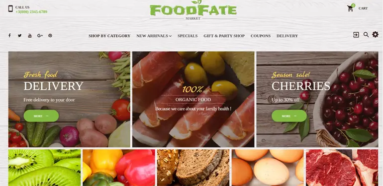
FoodFate
The design deals with selling organic food on the web. It’s a well-known fact that green, yellow and red colors are the most popular among food and drink related sites. The given design makes use of vivid green CTAs, which look contracting to the rest of the design elements and perfectly match yellow headlines.
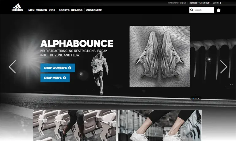
ADIDAS
If you visit Adidas’ official web page, your attention will be captivated with blue CTAs opposed to the classic black and white style of the layout.
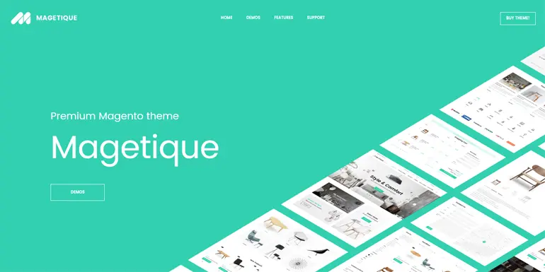
Magetique
A great example of how a series of digital products can be marketed can be found in a live demo of one of Magento 2 themes from TemplateMonster. The design is spacious and minimalist. Built with the main purpose to draw the attention of the online audience to a variety of web projects that can be created on the basis of one and the same theme, the live demo features a ghost CTA button surrounded by whitespace.
Dropbox
Dropbox stands out with its simple, minimalist, and spacious design. They make use of whitespace in order to make the content more readable and easier to scan. On their pages, even texts and graphics look simple and subtle. Although CTA buttons are designed in common blue branded hues, surrounded by negative space they stand out from all the rest of the elements added to the page.

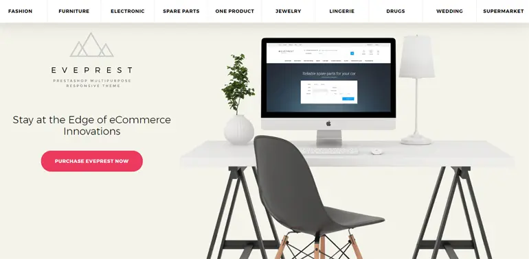
Eveprest
This is one more example of a live demo of an eCommerce site template. It’s supposed that a user will reach it after looking through the product details, so he is already familiar with a chosen item and won’t be irritated to see a “purchase” CTA at the top of the page. The latter, by the way, looks contrasting to the rest of the design elements that are designed in neat pastel hues.
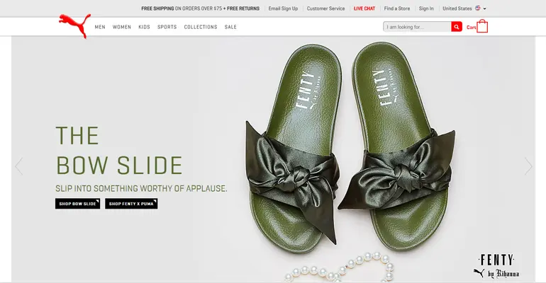
PUMA
As you navigate to the PUMA store, your attention will be captured by black CTAs. Such a color choice is not very popular among online retailers. However, when used within such a clean and minimalist design, they engage and captivate the audience.
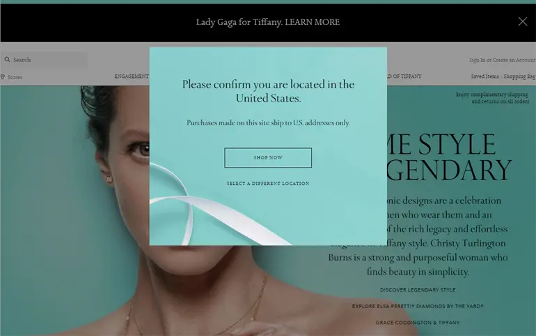
Tiffany & Co.
Unlike the previously highlighted designs, Tiffany & Co. site makes use of ghost buttons that look neat and elegant on a pop-up bar designed in branded colors, as well as CTAs featuring pastel tiffany blue hues surrounded with negative space.
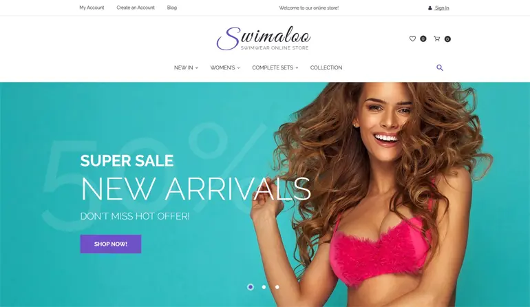
Swimaloo
The design looks by no means boring. The bold and catchy metro style adds a trendy presentation to the design. CTA buttons also look no less captivating. Designed in purple hues, they are also enhanced with cool animation effects, which add more interactivity to the design.
FINAL THOUGHTS
We hope that the aforementioned stats, tips, and examples gave you a hint on creating your own highly converting CTAs. Maybe you have your own observations on the matter? Feel free to share your knowledge with fellow readers below. Let’s find a key to creating highly converting CTAs.
P.S. if the aforementioned ready-made designs came to your liking, you can request their modification from certified freelancers and web studios. All of them are listed on Web Design Studios Catalogue.