Basically, the appearance of World Wide Web brought us multiple opportunities. Historically, the first connection was described in 1962 but you can see how fast the progress is. As a result, in 2018, all modern businessmen can’t imagine their company or startup without being promoted online. The truth is that there is no deal that will be able to stay popular without it. With it, eCommerce became an advantageous business model.
Surely, there are other powerful tools to use for business development and one of them is CTA. Actually, it comes for call-to-action buttons that make an effective selling model. They have lots of forms, shapes, and colors but any CTA is meant to make your prospects do something. These days, you can see the buttons almost everywhere. Any well-done website has a couple of CTA-s. Still, there is another type of the elements you should know about – email call-to-action buttons. What do they do and how to work with them? This post will tell you how to design the high converting CTA email buttons.
General Meaning
First things first, an email call-to-action button is the element that makes the recipient take a particular action. In a word, its main task is to interest them in your company, shop, brand, etc. Actually, an email CTA is not always a button. It can be an image, an icon, or simply a linked text. Any element of the letter that should direct people somewhere with a clean core message can be called CTA.


Same to the visual shape, the form of an email CTA can have many variants. You can offer a reader to download a free eBook, view out new items, check recent news from the blog, sign up for trains, open portfolio, and much more. You can literally use anything to carefully guide prospects through your services. In the end, a thoroughly created email CTA means a lot. It helps you to catch customers’ attention and do it wisely. For these simple reasons, today all the classy newsletter templates come with the pre-designed CTA buttons. Would you like to design your charming CTA?
How to design an email CTA that converts?
As you can see, any business type needs a professionally created email CTA. Thus, let’s see how you can get it. Just follow this small creative guide.

Buttons
As it was mentioned, the button is not the only form you can use to create a converting CTA for email. However, nowadays the HTML-based buttons are called the best solution. Why? At the outset, don’t forget how a human brain works. During a couple of last decades, we got used to the fact that a button is something to push on. It is just an expected fast response we feel automatically. As soon as an online user sees an email CTA button, their brain identifies it as the thing to click on. Well, according to the statistics, there is almost a 50% increase in clicks thanks to a CTA that has a button shape.
The next advantage of CTA buttons is that these elements are more adaptive than other forms. Choosing an email HTML CTA button, a user gets more control over its look on various devices. Also, the same thing is with browsers. To say more, some prospects prefer to disable pictures in their emails. With it, they will not see your image-based CTA. In this case, we recommend you to include alt texts. They can help readers to understand that there is CTA.
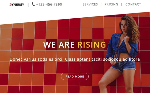
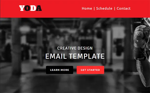
When it comes to the visual appearance, the first principle of designing a high converting email CTA button is easy. It says that the CTA should look like a button. Therefore, it should have:
- a pretty defined shape (usually CTA buttons are rounded)
- eye-pleasing contrasting color scheme that fits the look of the letter
- clickable look to let a reader identify it as a button.
To get an effective email CMA button, you have to study the behavior of web users. Knowing their reaction will help you to choose the right color. To illustrate, don’t make your CTA gray because a recipient may think that the link was disabled. At the same time, a strikingly-colored CTA button will make great work. For several years the most popular CTA colors are orange, green, and blue.
Simplicity
Working on the design of your email CTA button, don’t be afraid to make it simple. Creativity is a magnificent thing but does not overuse it. For example, you are free to experiment with gradients, shadowing, and other cues. Still, make the CTA simple. All in all, CTA is the element that needs to be easy-to-understand. Although it seems to be a regular step, we recommend you to use arrows. Statistics showed that it boosts click rates by 25+ %!
Use Triggers
Wherever you want to locate the email CTA button, make sure you have added some click triggers. Use the pluses of your services to show the prospects that this call-to-action button is worth pushing. To do it, use any way of presenting the information. For example, these days Testimonials feature are the most popular tool. Also, you can add ratings, statistics, infographics, counters, etc. Now you need to make a reader think that clicking the button will bring them something lucrative. Finally, do it cleverly. Don’t overload the email and don’t praise your company.
Coloring
To start with, you have to understand that there is no color that is 100% perfect for an email CTA button. Your choice depends on your style, so even the most popular colors can ruin your design if they do not fit it. It means that you will never find a real ready-made design decision for CTA online. Still, you can check the information to find it by yourself.
There is no secret that different colors and color schemes awoke different emotions. Use this technique to create a winning email CTA button. Think about the emotions you want to get. Once you are through this, choose the relevant color.
What is more important, building an email CTA, you should pay attention to contrast. Thus, the chosen color should be visually highlighted. Make it stand out from other components of the email. We recommend you to avoid using this color for any other elements. On the other hand, the color (or colors) you use should harmonize with the rest of the letter. In addition, don’t forget to use your white space to emphasize the CTA button.
Sizing
Sizing your email CTA button is the next thing to think about. You need to find a golden mean, so the button will not be too small or too big. With it, remember that CTA text should be noticeable. Make it bigger than the text of the letter to stand out. Use the rule of thumb that will also help with the mobile version.
Positioning
As always, the location of the button matters. It matters a lot because the success of CTA really depends on its visibility. Once again, there is no one and only option to fit an email CTA button. You can use the A/B test to figure out the best way to locate CTA. Luckily, we have 5 working tips to place an email call-to-action button.
- Use ‘above the fold’ space to locate your email CTA button. It brings you the attention of those users who will not read the email until the end.
- Always prefer the right-hand side position because it is the most natural way to present information to western readers.
- Use the upper-left corner to place a call-to-action button for mobile-oriented emails. With it, you can be sure that the button will not be cut out of the frame.
- What is more, we recommend you to duplicate the CTA button. Firstly, locate it in the beginning of the email. Secondly, put it in the middle or at the end of the letter.
- Don’t be afraid to add a short description of your email CTA button.
Choose The Very Design
In fact, email CTA buttons are meant to lead readers to business or personal websites and their parts. In could be a new album in your gallery, a recent article from the blog, a selection of products that are on sale, and more. Anyway, clicking on a call-to-action button, a reader expects to see your content. That is why creating the CTA button, you should choose the same design that you used for the site. Needless to say, these days there are so many intruders and webspace is a sweet place for them. Thus, online users are afraid of cheating. If your web design is completely different, a prospect may think that it is a trap. They will live the website and probably block your email.
As you can see, a smartly designed email CTA button can improve the work of your company. It is an easy but advantageous way to get more traffic and find new customers. Still, although the process looks simple, you should work hard to design an email call-to-action button that converts. Fortunately, now you know all the main secrets, so the rest is up to you. Good luck!