
I love WordPress and I know many of you do too. The folks over at Testking.com also love WordPress and have decided to express their love by gathering information and creating an infographic that shows how popular WordPress is.
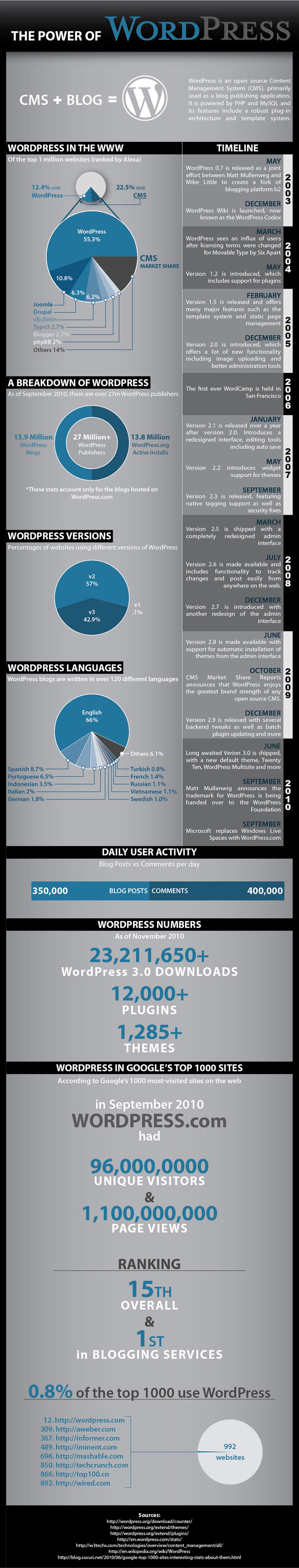
The Power of WordPress infographic features the different timelines of WordPress releases and major milestones from 2003 to 2010, the number/percentage of websites on the Internet that use WordPress, daily user activity, statistics like total number of downloads, total number of available themes & plugins and other information or statistics about WordPress.
If you’re an avid WordPress user, theme/plugin developer or someone who just simply loves WordPress, I’m sure you’re gonna like this infographic.


The Power of WordPress infographic by Testking.com
Click here to see the full sized image of the Power of WordPress infographic.
Although all of the information contained in the infographic can be found at WordPress Codex, you have to appreciate the time and effort that the folks at Testking.com put into making this infographic.
If you like this infographic, then you might also like another WordPress related infographic – the Prolific WordPress infographic created and released by Page.ly a few months back.
NOTE: The infographic has a small typo on Matt Mullenweg’s name (Timeline – Sept, 2010). I’ve notified the author and I hope he fixes it and uploads an edited version soon.
What do you think of Testking.com’s Power of WordPress infographic? What other important WordPress data or statistics should be added to the infographic? Please share your thoughts.


@zammax – that’s what makes WordPress a popular and easy choice – the availability of many free themes and plugins.
I like WP too because it is easy to use and customize with so many plugins available
@Archon – Isn’t it cool? If I had the design skills and the time, I’d also make a WordPress-related infographic. :D
I love the infographic. WordPress rules!