
Late last month, Google gave Gmail users a preview of the new Gmail user interface. The interface redesign is part of a series of updates for the purpose of making Gmail better – look clean, removing unnecessary clutter and at the same time provide an easy and smooth user experience not only for Gmail but also for other Google products. From what I know, the first one to sport this new user interface was the Google homepage (Google.com) or Google Search.
That’s one of the reasons we’re embarking on a series of interface updates to help strip out unnecessary clutter and make Gmail as beautiful as it is powerful. This is part of a Google-wide effort to bring you an experience that’s more focused, elastic, and effortless across all of our products. The changes are not going to happen all at once. We know that you love and care about Gmail as much as we do, and we’ll be working on these upgrades gradually over the next few months to allow plenty of time to understand and incorporate your feedback into the evolving design.
For now, there are only two themes available for the new Gmail interface – Preview and Preview (Dense).


Inbox View
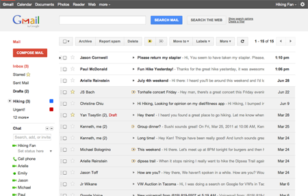
Conversation View
If you haven’t tried the new Gmail interface, you can enable it by going to the Themes tab on Gmail settings.
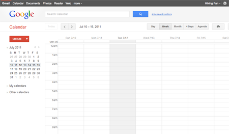
Aside from Gmail other Google products are also slowly but surely getting the same interface facelift/redesign. One example is Google Calendar sporting the same new user interface as Gmail.
Personally, I really like the new user interface that Google is using/implementing into its products. I liked it the first time I saw it on Google.com/Google Search and was happy to find out that it was also available for Gmail. Btw, because of Google+ I find myself using the web version of Gmail more often these days than Thunderbird.
Anyone else tried the new Gmail interface? How do you like it? What are the things you like/dislike about it? What other features or options would you like to see added to it? Please share your thoughts.
It’s great
I hate the new interface. I want the OLD GADGET back!! How do I get it back. I don’t have an iphone and I don’t like seeing all my messages on my iGoogle homepage. I liked it the other way.
I’m a fan of minimalist designs but I think this one has too much white space and light colors.
Overall though I welcome the UI refresh.