
![]()
Have you seen or tried the new Gmail interface? The new look was officially announced and launched last week so I’m sure some of you have already seen it, tried it or even already using it. The new Gmail interface features a cleaner and more modern look, an elastic density design and gives users more control by providing more customization options. It also features a new toolbar that displays icons of basic options/features and a new search box that makes it easy for users to find stuff.
Here’s an overview of the improvements and features of the new Gmail look:


Screenshots:
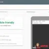
Main interface
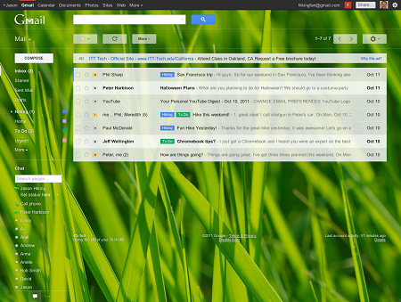
HD Theme
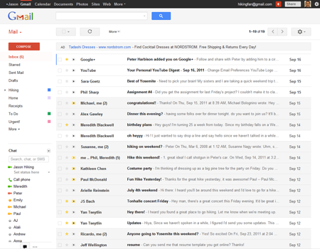
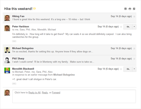
Improved Conversation View
I really like the new Gmail look/interface. The new toolbar makes it very convenient to do the basic stuff you need to do with your emails like Archive, Delete, Move To, Label and Report as Spam. The same goes for the new toolbar that allows users to find exactly what you’re looking for. You can specify the folder name, name of sender/recipient, subject title, specify certain keywords, specify whether it has an attachment or not and provide a specific date.
Another cool feature is the Elastic Density design which allows users to view their Gmail inbox nicely from any device or screen size because space elements now automatically resize based on the display you’re using. The interface also automatically changes when the browser window is resized. Display density can be manually configured via the Settings menu.
I like my inbox clean and simple so I haven’t tried the new HD themes. If you’d like to use one, just click on the gear icon on the upper right portion of Gmail and select Themes. Then head on over to the HD Themes section and select a particular theme that you like.
To learn more about Gmail’s new interface and features, check out the dedicated page for Gmail’s new look.
For those who haven’t tried the new Gmail interface, you can enable it by logging in to your Gmail account and click on the “Switch to the new look” link found at the bottom-right corner of Gmail.
Anybody else tried or are using the new Gmail interface? How do you like it so far? Do you prefer the new look or the old look? Please share your thoughts.

Wow, it’s been a while since I dropped by here and commented! Well, I’ve been laying low from the online world for nearly a whole year now, hehe.
Anyway… I do like the new Gmail look… although I don’t use it that much. It looks cleaner, less cluttered.
the new theme looks clean and i like it that way
The same goes here – I like the newer interface being cleaner and lighter. But others have pointed out somewhere that the operation is net yet that smooth, hence further improvements are still expected.
Where did “settings” go??
Don’t see it in either version. Had to jump backwards & forwards before I loced it (re the old version).
Please tell me setting is going to be easier to locate soon.
Pea
The new look is nice, but I still prefer the old one. But then again, I’m old school.
I asked the same question about Google Reader’s makeover.
I like the new features, but the visuals of the UI seems a bit too minimalist. Being a fan of minimalist design, it means a lot to me.
There’s too much white space with too little lines that define the edges of each section making it a bit hard to focus on reading email. It could use a bit more contrasting colors.
Overall though, it’s a good upgrade to Gmail.
That was really smooth to navigate and fast to load but I haven’t finally switch, I still love the old one.lol..
I love the new look. I normally don’t like change that often but gmail totally got it right :)