I barely login to the web-based version of Gmail because like some of you already know, I use an email client called Mozilla Thunderbird to access my Gmail account. Because of that, I didn’t notice Gmail’s recent homepage makeover. I only found out about it recently, when I visited the official Gmail Blog and read their announcement.
If you visited the Gmail log-in page recently, you may have noticed that things looked a wee bit different. We decided to give this page a bit of a facelift and updated a few of Gmail’s other pages while we were at it. Our goal was to keep a familiar look while freshening up the graphics and trimming down the text (we cut out over 250 words in the process).
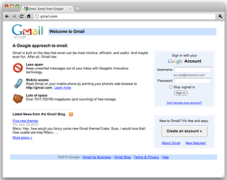
Check out the Before and After screenshots below to see the results of the recent Gmail makeover.


Before
After
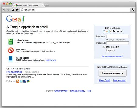
Aside from that, the Gmail team has also redesigned the Gmail logo.
![]()
The changes made by Gmail’s design team are subtle and if you didn’t know it, I’m sure you wouldn’t notice it right away. They changed some of the icons and rearranged them and have also edited out some of the text. They’ve also added a few social media icons on the lower left portion of the page so users can follow the Official Gmail Blog for the most recent updates and news.
What do you think of Gmail’s recent homepage makeover? Do you like the new homepage redesign? Which one do you prefer, the old logo or the new logo? Please share your thoughts.